In the debt collection industry, if you haven’t updated your website to meet today’s consumer expectations, you’re probably already losing revenue. A user-friendly debt collection website is a necessity if you want to stay competitive and effectively engage consumers.
The Consumer Financial Protection Bureau’s (CFPBs) Regulation F attempted to clarify many aspects of compliant debt collection like text messaging and email guidelines, call caps and more. This release has since sparked analysis by industry experts on what it will mean for the future of debt collection agencies.
One such expert, Joann Needleman of Clark Hill Law, said in webinars focusing on Regulation F that at its core the rule is about bringing debt collection into the 21st century and giving consumers more control.

What to Consider When Building your Debt Collection Website
Some of the top concerns when building a debt collection website to reach every audience are:
- Clear navigation: your design should allow visitors to quickly and efficiently achieve whatever purpose they have for coming to your site.
- Consistent visual brand: your design should have a cohesive look and feel through elements like color, logos and fonts, so visitors know they’re in the right place.
- Building trust: your design should incorporate trust symbols like client logos and award badges. Include customer testimonials or reviews as other ways to build your reputation through your website.
Debt collection agencies should also prioritize web design and features that help consumers get the information they need from your company without having to reach a live agent.
For example, consumer portals can handle electronic disputes, communication opt-ins, and information requests, as well as address legal disclosures and E-Sign Act consent. This allows consumers to take control of their account and simplify the debt collection process.
What are Some Best Practices for Maintaining a Website?
Corporate websites are a big target for hackers. It’s imperative that security patches are updated as soon as they come out.
It’s also a best practice to use the latest version of your website software and the plug-ins being used. Agencies should also stay updated on the ever-changing compliance requirements of the collection industry.
Debt Collection Website Building Services
Some agencies won’t have the time or resources to build consumer-friendly, compliant websites. For those businesses, it’s often a better choice to hire a company that understands industry necessities and challenges.
For example, Kindred Force Media recently launched a website building service specifically for the accounts receivable industry that follows the design best practices and compliance requirements unique to collection.
Debt Collection Websites With Clear Navigation
1. MRS BPO, LLC

MRS BPO, LLC is a national debt collection agency based out of Cherry Hill, New Jersey.
Their homepage clearly speaks to each of their audiences — job seekers, potential clients and consumers looking to pay a debt. Each audience has a clear path which directs them to the next stage in their journey with MRS.
It also establishes trust by displaying certifications and memberships to associations that educate on compliance best practices for their industry.
2. COMMERCIAL ACCEPTANCE COMPANY

Commercial Acceptance Company is a premier consumer credit and collection agency located in Pennsylvania. The agency has been in business for over twenty years and represents over 600 clients nationwide.
Their homepage clearly tells consumers where they need to go to find help with both an FAQs section and a link to a Contact Us page. The page also provides a Pay Online button in the navigation bar and a second section that provides helpful links specifically for consumers.
The webpage also shows potential clients where to find more information about working with CAC.
3. Frost Arnett

Frost-Arnett is a Healthcare Receivables company that has been in operation since 1893. You can see from the main page of their website they have put much thought into directing all of their audiences to the resources they need.
The green banner and payment buttons are all color-coded in green to catch a consumer’s attention right away. The contrasting blue buttons all correspond to client resources, so prospects can clearly see where to learn more about the business or request a proposal.
4. IC System

Founded in 1938, IC System is a family-owned collection agency headquartered in St. Paul, Minnesota. Their homepage does several things well, but what is most prominent is how clearly they direct each audience to the correct information.
The banner at the top of the page directs visitors to a client portal, a consumer help page and a button to make a payment. The main website image also directs potential client customers to “pick a program” and consumers to “consumer help.”
A bonus feature on their homepage is the utilization of a web chatbot providing a fast, easy way for website visitors to find the information they need to help them make a payment, get more information about their account, and find additional helpful resources.
Debt Collection Websites With Strong Visual Branding
5. ROCKET RECEIVABLES

Rocket Receivables is a debt collection program powered by TSI, a full-service nationwide debt collection company.
On their homepage and throughout the website, the company has a clear, recognizable visual brand. In addition to their use of consistent branded colors, they also use animations and graphics that follow the rocket theme.
6. KANSAS COUNSELORS, INC.

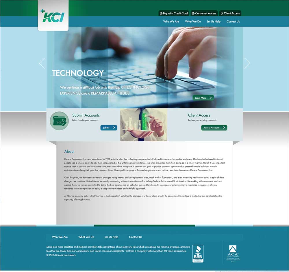
Kansas Counselors, Inc. has been in business for nearly six decades. Their straightforward website maintains consistency in color scheme throughout every page. They also mark each web page with their logo, which reinforces the color choice of the backgrounds.
The homepage also provides clear navigation buttons in the top half of the page so that consumers and clients know where to go to get more information.
7. ICS COLLECTION SERVICE

ICS Collection Service is a Chicago-based collection agency that was established in 1940 to serve the billing and collection needs of Chicago-area hospitals and physicians.
Their website uses consistent visual branding with a color palette that relies on black, white, and different shades of teal green. They utilize photography overlayed with their signature green.
Although their homepage messages mainly to prospective clients, they prominently display FAQ, Pay Your Bill, and Dispute buttons in a sticky header on every page. This way, consumers can find information they may need when dealing with a past-due account.
Debt Collection Websites That Build Trust
8. A-1 COLLECTION AGENCY

A-1 Collection agency is a subsidiary of Healthcare Management, owned and governed by 20 rural hospitals and healthcare organizations. Their homepage uses several trust building tactics to put consumers and clients at ease.
The page highlights the company’s dedication to empathy, and uses a customer quote to build trust in the brand. Further down the page, the company mentions the compliance measures they follow, for another example of their trustworthiness.
9. TrueAccord

TrueAccord is a debt collection agency founded in 2013, located in San Francisco, CA.
On their website, they promote trust by displaying association and compliance logos, and using real customer testimonials on the home page.
In addition, the company links to their company’s google rating for more social proof. These badges boost legitimacy and prove customer satisfaction.
Bonus points to TrueAccord for using a timed pop-up when first visiting their website, to help direct consumers and prospective clients to the correct information.

10. CHASE RECEIVABLES

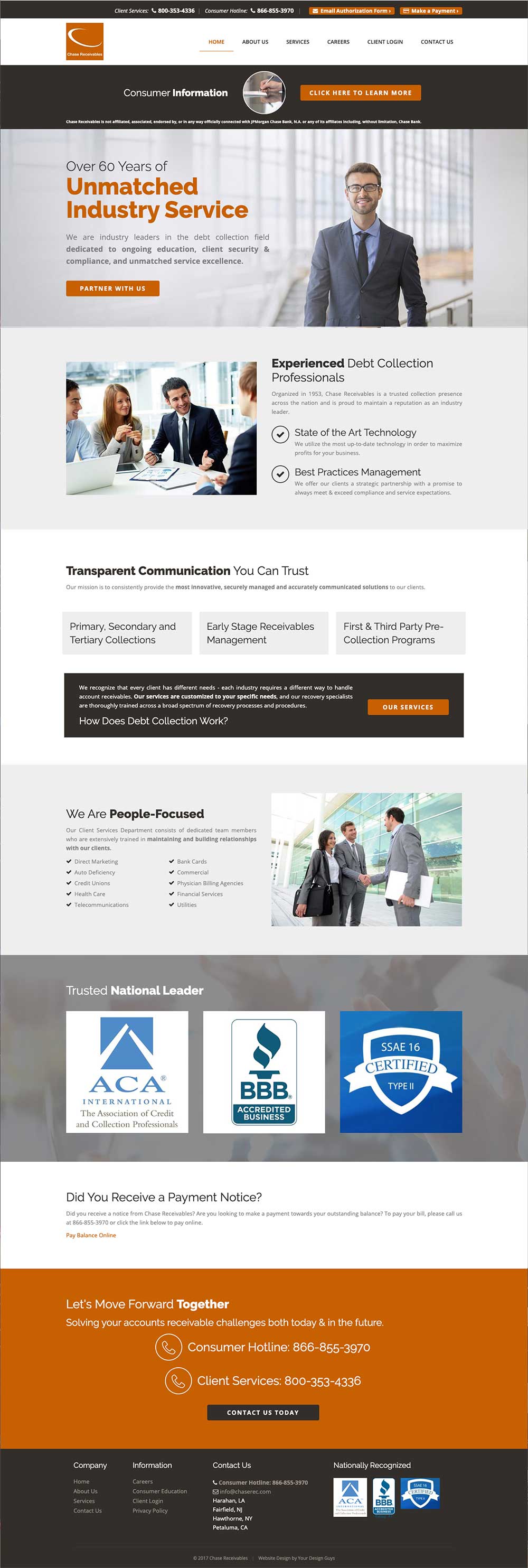
Chase Receivables is a national collection agency based in California. The first striking detail about their website is the proclamation of “over 60 years of unmatched industry service.” This longevity is an indication that the company has been long trusted by both clients and consumers.
The website also offers phone numbers to reach the company’s office and clearly guides consumers to educational materials. This kind of transparency shows that Chase Receivables is open to a dialogue with consumers and has their best interest in mind.
These are just a few of the ways you can improve your debt collection website to better serve both your audiences — consumers who want to pay a bill and prospective clients.
Sign up for weekly email updates or to our monthly newsletter for more resources and strategies to improve the payment experience for your consumers and create a better cash flow for your business.


